Lessons Brands Can Learn From Experiential Activations
I've lost count of how many activations we've built and designed at this point.
Some that ran like clockwork, some that taught us the hard way, and every single one that left me with a slightly better understanding of what actually makes people stop, engage and remember a brand. So I wanted to pull those lessons together, because I think a lot of them apply whether you're planning a full-blown festival or just trying to make your next pop-up feel less like a stand and more like an experience.

1. People remember how a space made them feel, not what was on the branding
You can nail every guideline in the brand book and still end up with something forgettable if it doesn't actually feel like anything.
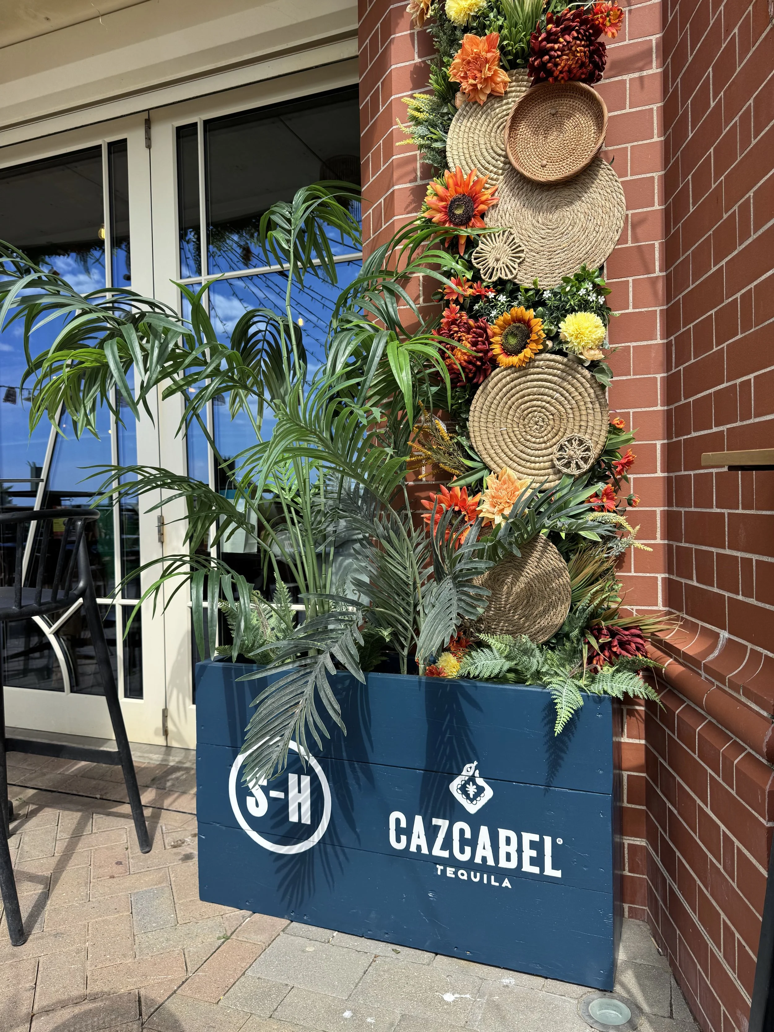
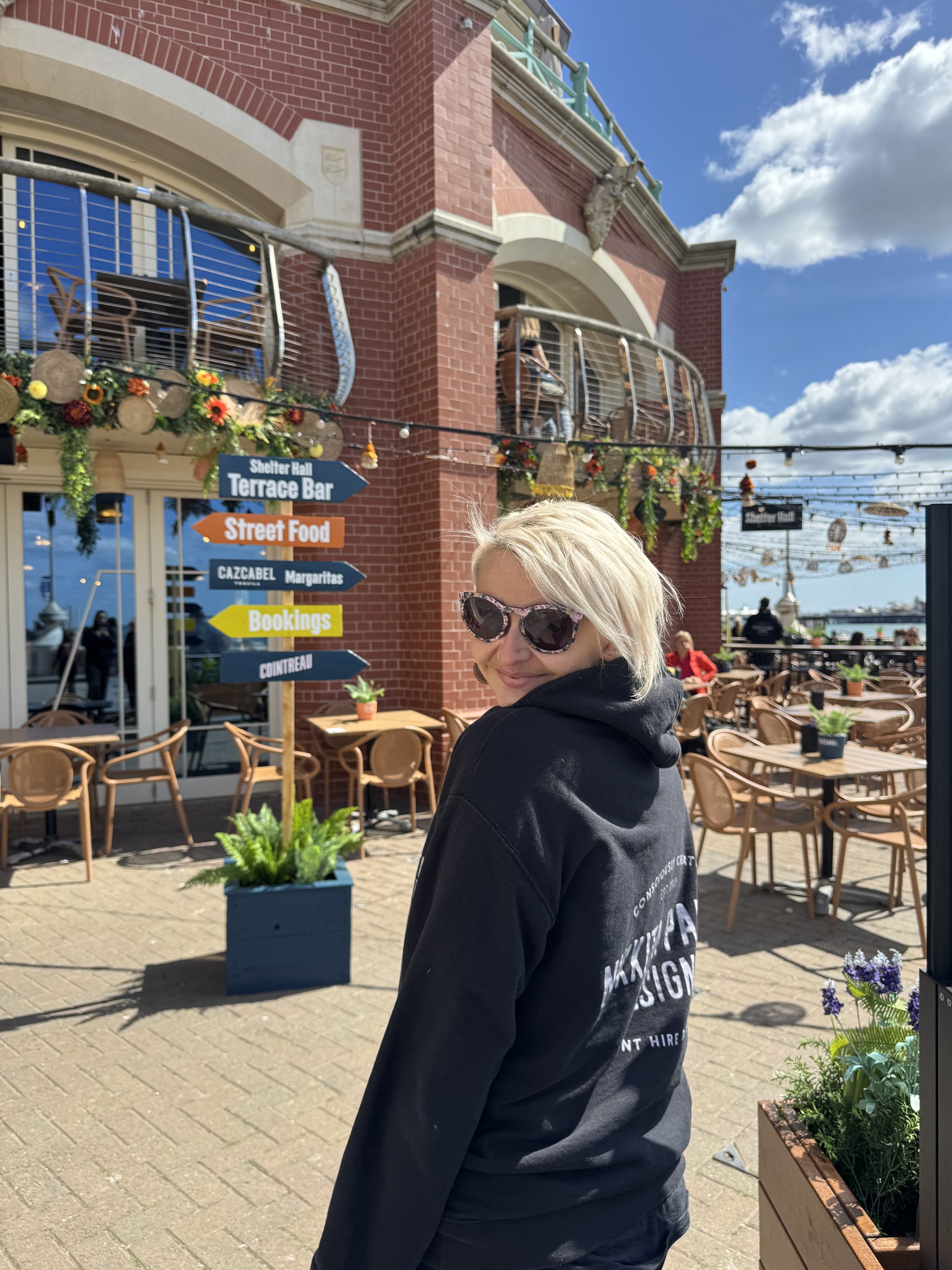
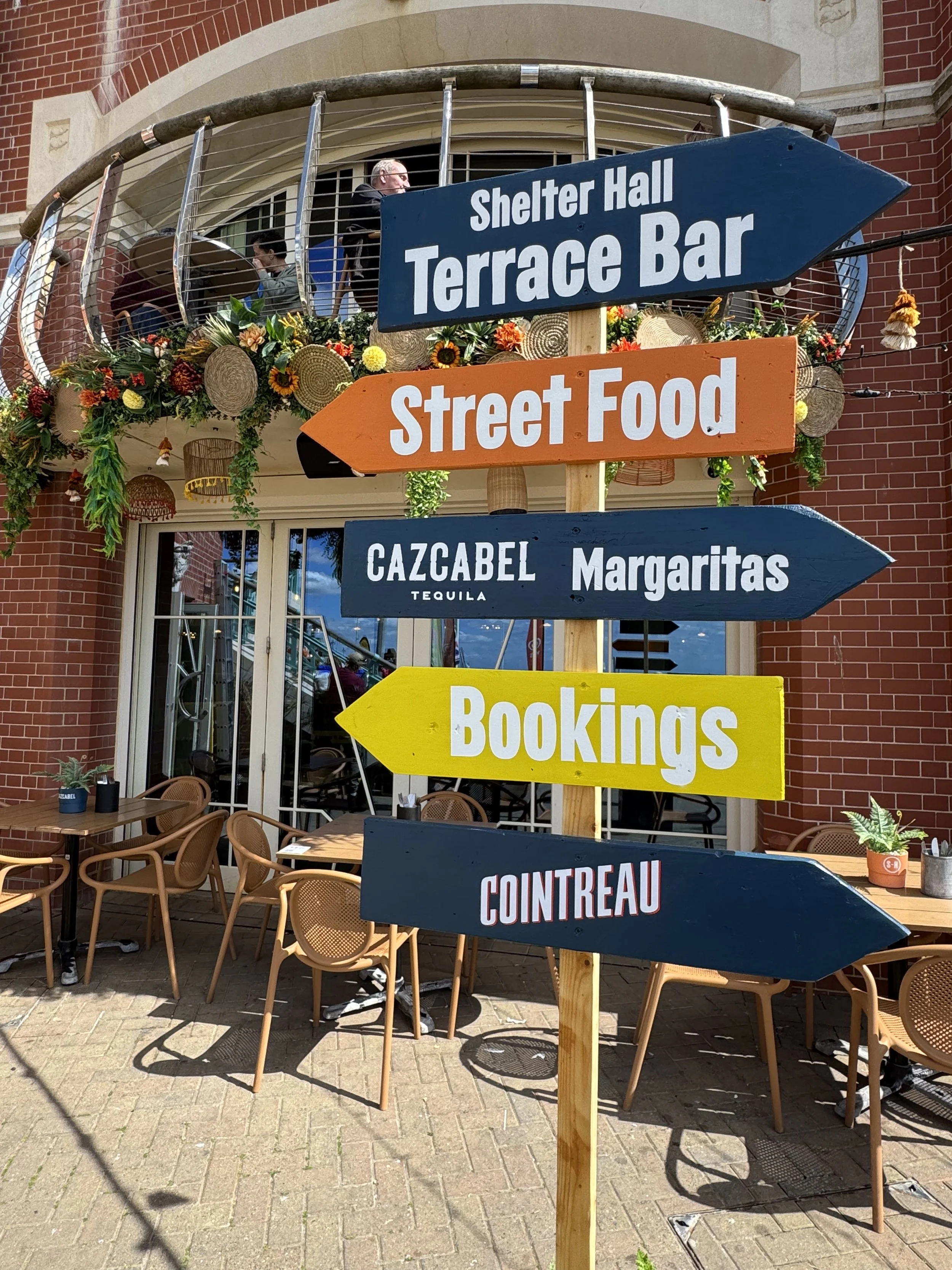
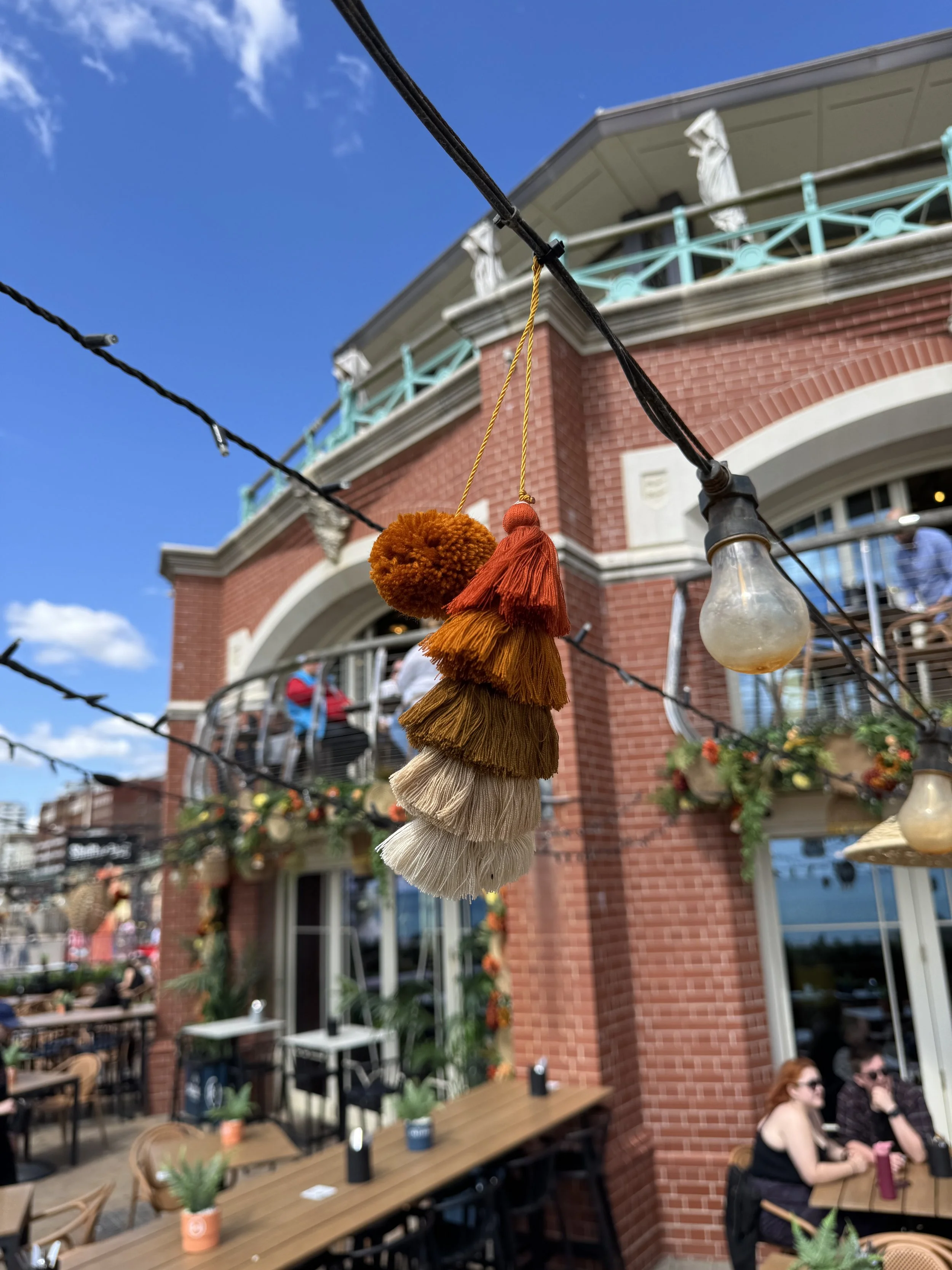
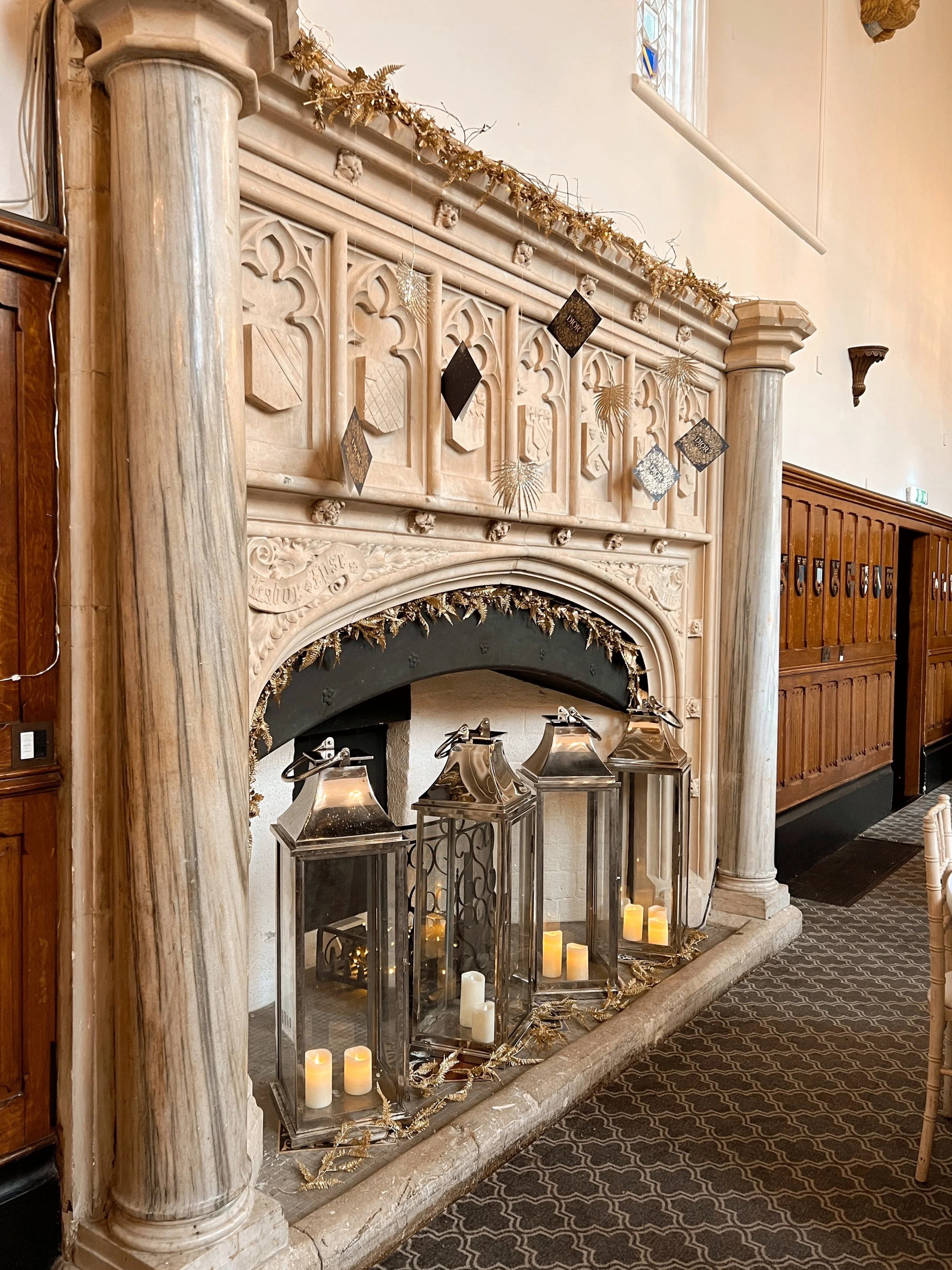
The activations that stick in people's minds are the ones with a mood (whether it be warm, chaotic, glamorous, playful, whatever it is that they can describe in one word afterwards). That feeling comes from lighting, materials, sound, scent, staff energy, the lot. Don’t stop at branding cups and roller banners, please.
2. Design for the phone, but don't design only for the phone
Yes, the photo moment matters; we always build one in and it’s obviously a huge part of what we do! But if the whole space is one big backdrop and nothing else, you end up with a room full of people queuing for a picture and disengaging with everything else you've built. The best activations give people a reason to linger even after they've got the shot: a drink to make, a game to play, a reason to talk to the person next to them.




3. The details nobody "notices" are the ones doing the work
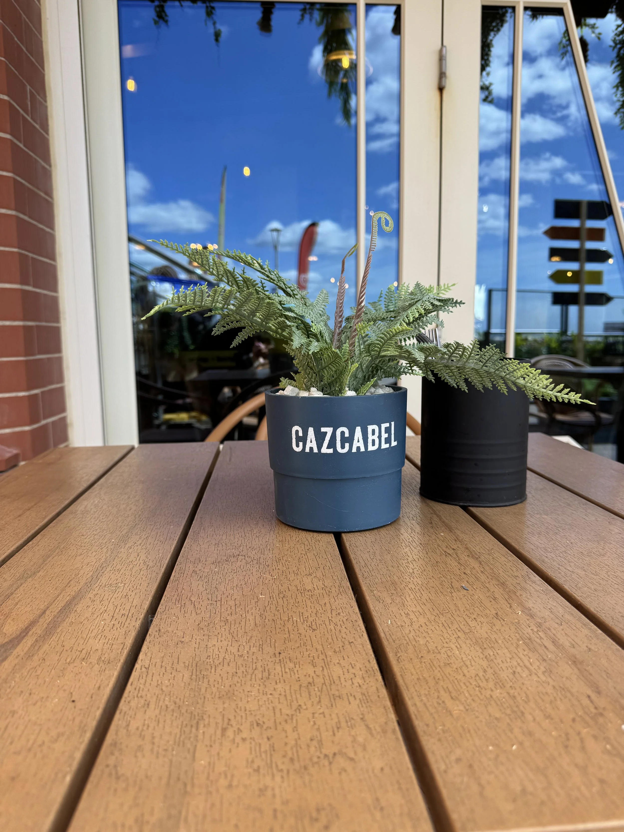
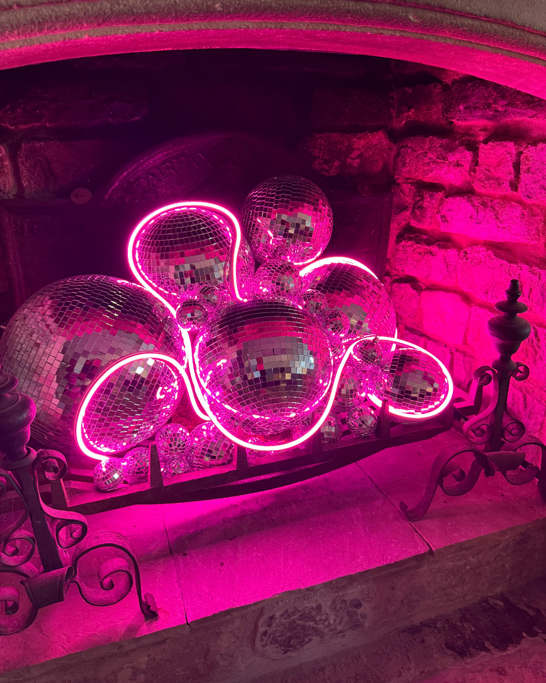
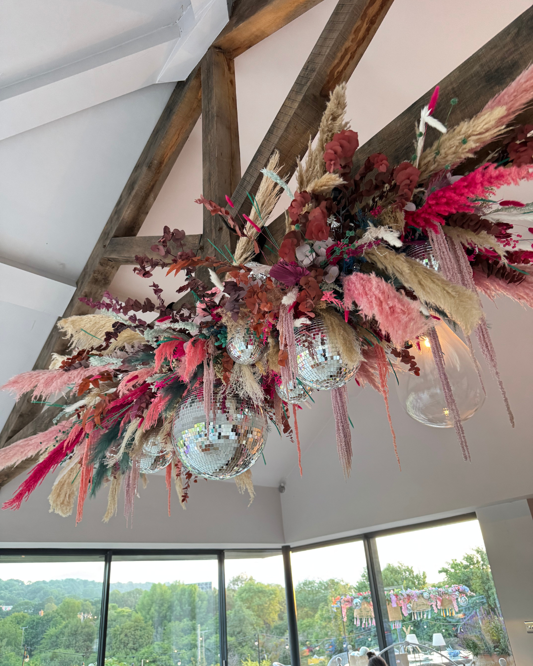
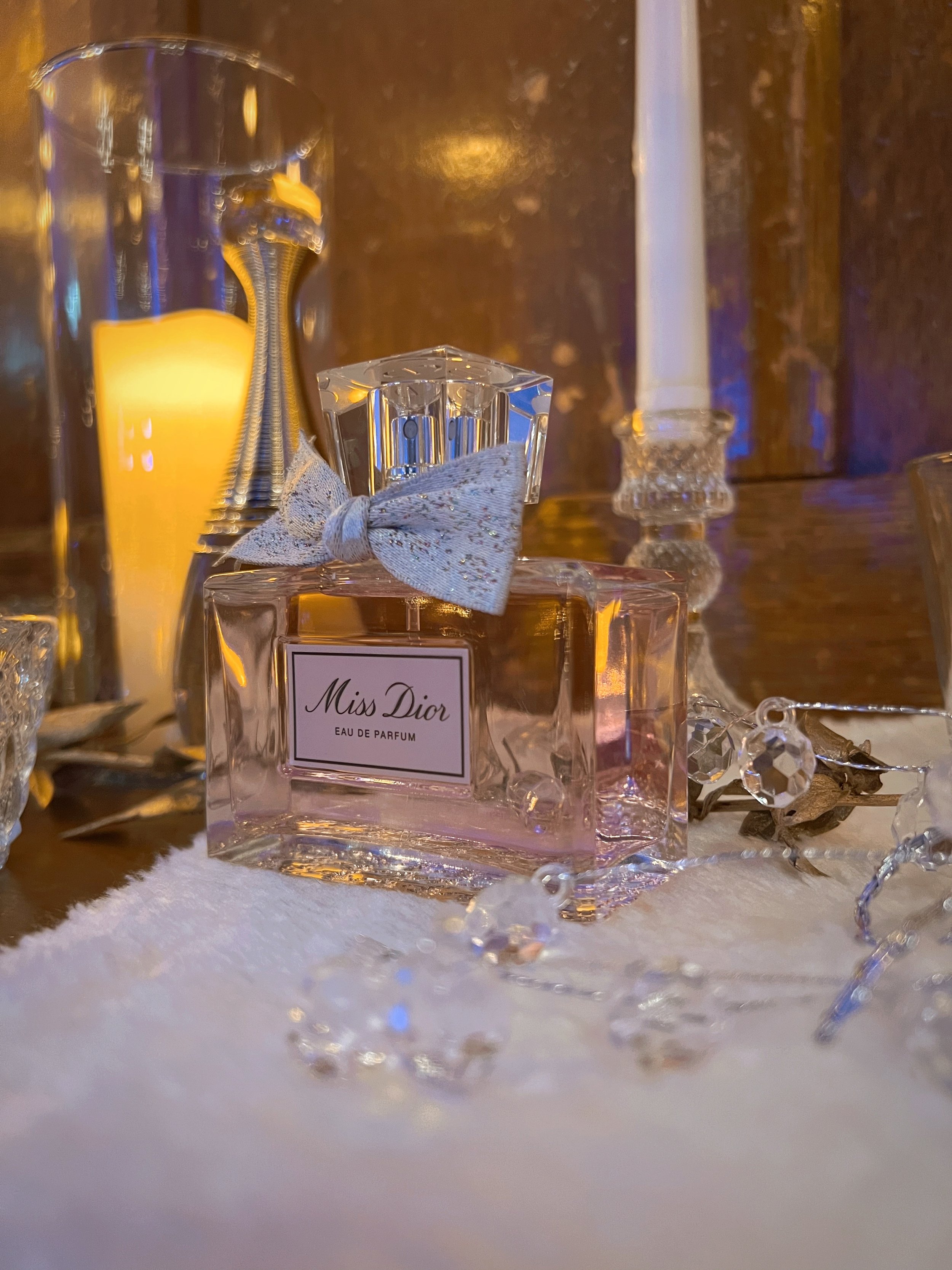
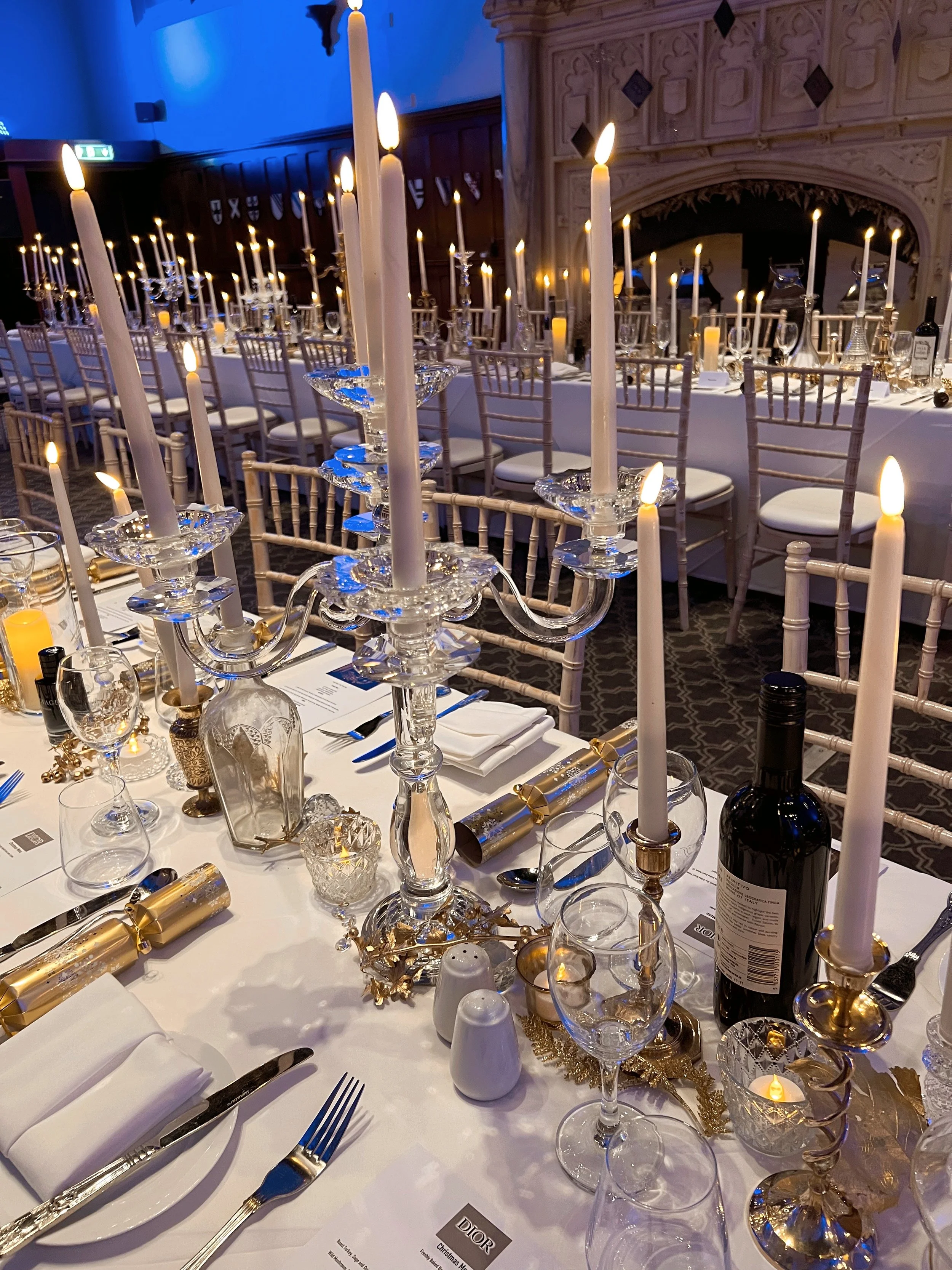
Nobody consciously registers that the coasters match the colour story, or that evening lights have turned wamer, or that the playlist shifts vibe as the evening goes on. But they feel the difference between a space that's been considered and one that's just been assembled. Consistency in the small stuff is what makes a big space feel intentional rather than thrown together.
4. Constraints make better ideas, not worse ones
Every brief comes with a limitation.
A tricky venue?
A tight budget?
A two-day build window?
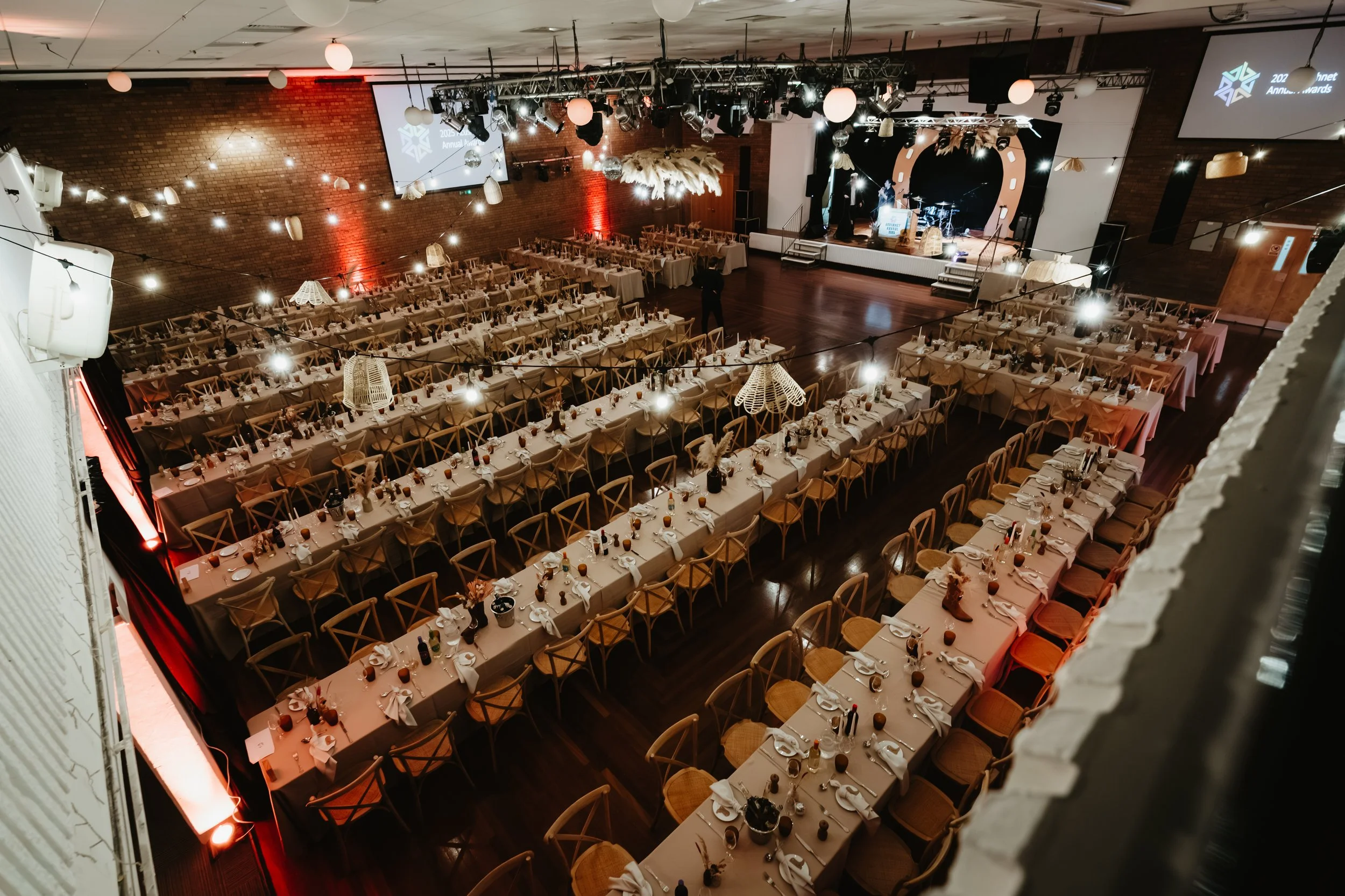
I used to see that as the enemy of a good idea, but now I see it as the thing that forces a good idea to actually happen, instead of staying a nice concept on a mood board. Some of our favourite outcomes came from working with an awkward space rather than fighting it. It’s not aaaaalways meant to be easy!
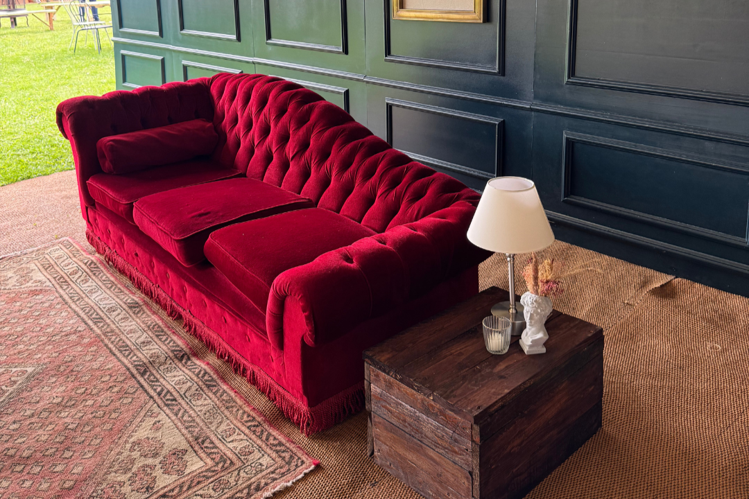
6. Furniture and props aren't decoration; they're storytelling tools
This one's close to home for us, given where we started.
A bar built from reclaimed timber tells a different story to one in metal, even if they're serving the exact same drink. Every material choice is doing narrative work whether you've thought about it or not, so it's worth making sure it's saying what you actually want it to say.
7. The brand should own the room, not just show up in it
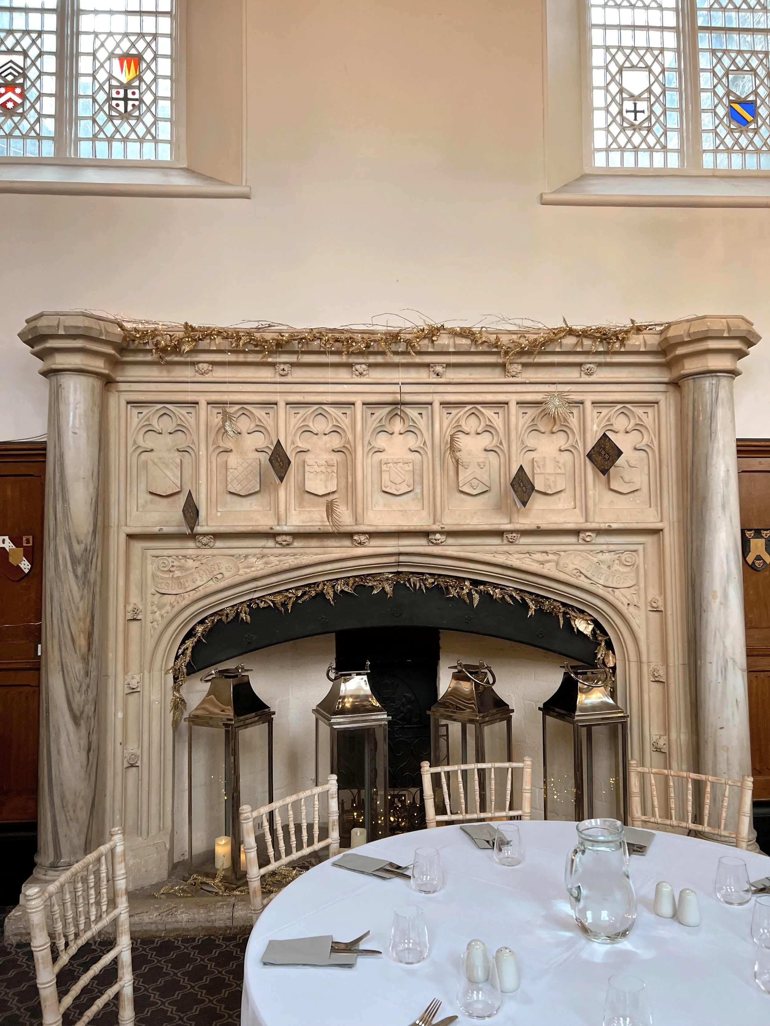
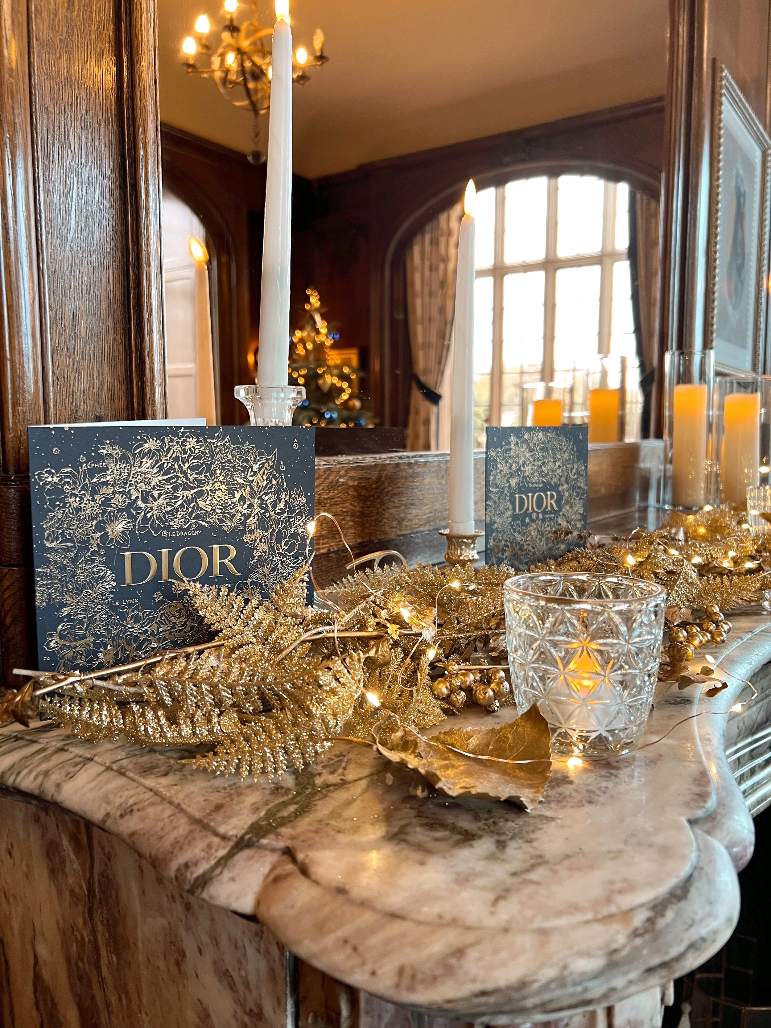
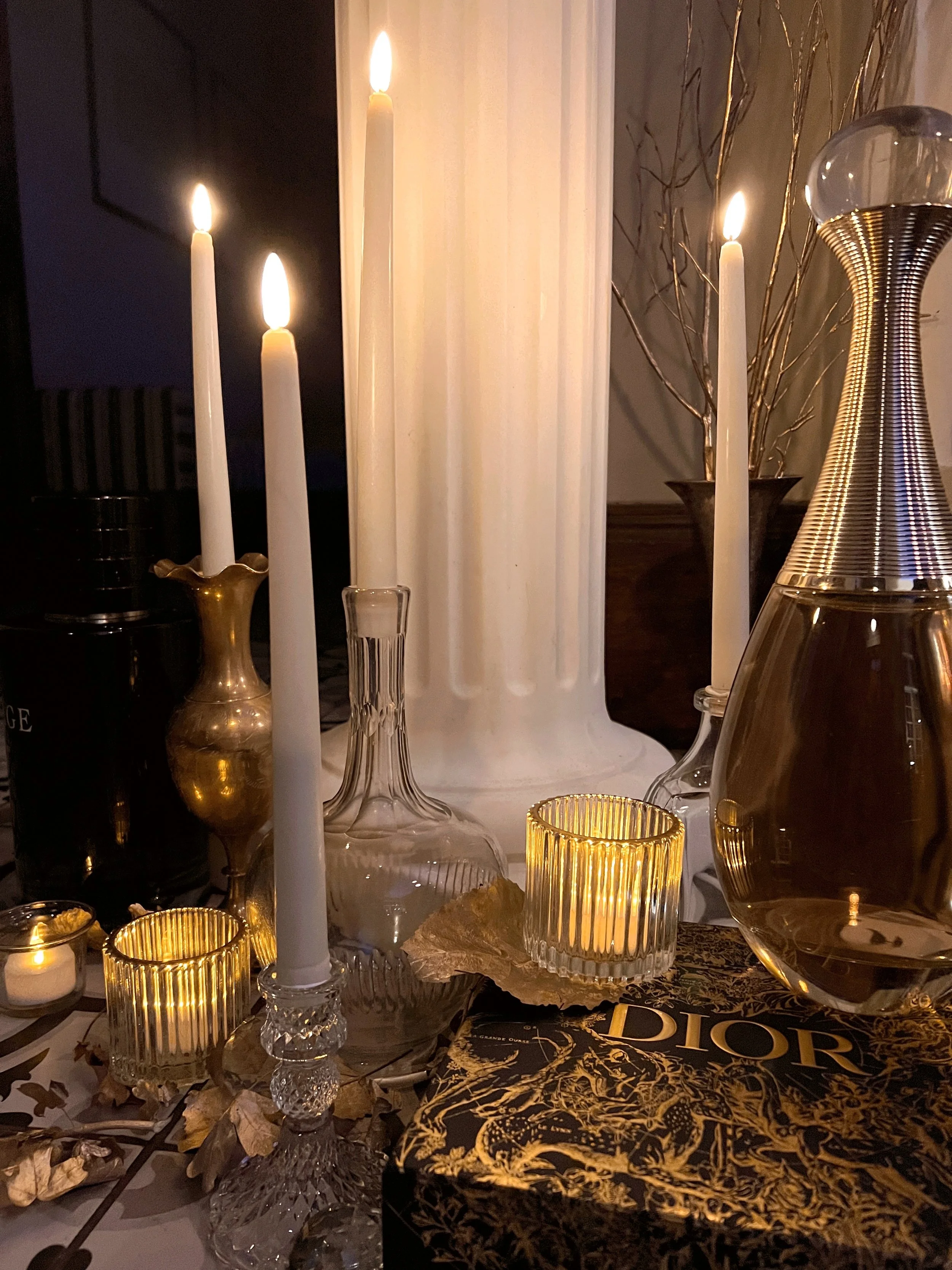
The best test I've found is if you could swap this brand out for a competitor and the space would still make total sense? If yes, something's missing. The activations that really land are the ones where the space, the drinks, the styling, everything, only makes sense for that one brand.
That's when you know it's working. Not just a nice-looking room with a logo on it, but somewhere that couldn't belong to anyone else.
Speak to our team.
Every activation teaches us something new, and honestly, that's half the fun of doing this!
If you're thinking through your next brand moment and want a second pair of eyes on it, you know where to find us.